When companies rebrand, their voice changes. They grow up. They adopt new, more mature ways of thinking.
To signify the rebrand, sometimes their name changes, but almost always their logo transforms. A change in logo means a change in how the letters of the name look, which trickles down to and inspires the typefaces a company uses.
Recently, I’ve seen an interesting trend of companies embracing serifs, the little “feet” you see on the kind of fonts you’d write a school essay with.
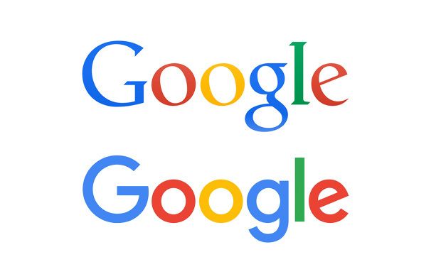
This comes as a shock because the industry, about ten years ago, seemed to make every move away from using serifs in text. Take the well known transformation of the Google logotype from serif to sans-serif.
Although MongoDB had always used a serif typeface for their logo, they recently rebranded, and with that came the use of serif typefaces in places that you wouldn’t expect, like in their dashboards where you configure a database.
At first, it feels a little out of place. Over the past ten or even twenty years, we’ve gotten used to seeing sans-serif typefaces in technical places. This may have been a trend at first to compensate for low resolution screens, which couldn’t show the fonts’ little feet even if they tried, but it stayed to become the expectation on digital displays.
Why does it look strange? Perhaps it reminds us of those posters from the early twentieth century.
Which, by the way, have always amused me for their use of no fewer than ten typefaces on the same poster.
Maybe this is why it looks strange to see these kind of fonts show up in screens that had previously been dominated by sans-serif fonts.
What prompted me to write this was ProtonMail’s recent rebranding to Proton.
They hit on a lot of reasons why we’re seeing more serif typefaces in digital places.
Proton has always been a different type of tech company, so we wanted to choose a brand and website font that would also defy the expectations of the tech world, which regularly favors bold, sans serif typography.
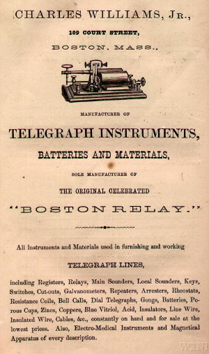
Rewind about twenty or even thirty years, and the same could be said for the opposite. In a world dominated by mundane, lawyer-esque, serif typefaces that remained from the days of Williams, technology companies chose sans-serif typefaces to defy the expectations that people had about businesses (and to make the type legible on CRT displays).
We are building an internet that puts people first, so we felt our font should have a more human touch. A font that can be used to tell stories, a font with empathy and warmth that reflects how Proton is different.
And what does that mean? A return to the serif typefaces used to tell stories in books.
our headlines will use Flare, a nearly-but-not-quite sans typography that makes a bolder statement.
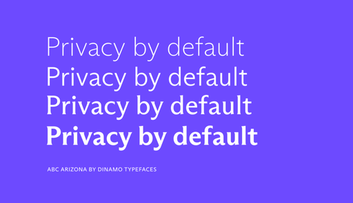
They’re right, it doesn’t quite look like a typeface that you’d see in court documents, yet it has small but distinct serifs on two of the variations.
It’s a push and pull.
What started out as unique became mainstream, so companies must once again rebrand to stand out.
Most of the interactions we have with computers is through reading things on screens, and the typeface is the means through which a company expresses itself in this world dominated by writing. Since these typefaces are looked at so often, we become habituated easily, so a change in type is often a quick way to change people’s perceptions of the writing and what it represents.
There’s a lot of room for experimentation, and I hope more companies adopt typefaces that can’t be classified as either sans or serif.
Maybe the title of this post shouldn’t have the word “serifs” in it, but there’s not really any other name, at least yet. In the article on the Proton rebranding, they mention the world “flare”, which sounds familiar, but alas, no one would know what a flare is, so until it’s a little more widespread, I’ll call it a serif.