A while back, I was looking for the perfect typeface. I think I found it.
I wanted a couple of my personal websites to share the same feel, yet be unique. How do you accomplish that? If you want to change the colors, the layout, the shapes, then the only thing consistency can arise from is the typeface. I didn’t even want the same font, just the same feel. The fonts can be different, like one being sans-serif and another serif, but the typeface—the design ethos—should be the same.
When I write on a computer, it’s usually in a monospaced font. I never really thought about why. Maybe it makes me feel like I’m sitting at a typewriter? Perhaps it goes along with being in editing mode. I might want to focus on the idea instead of the presentation. Could this perfect typeface also have a monospaced font? That way, I can have the same feeling while drafting, without editing in a font that’s too decorative.
Upon Matthew Butterick’s recommendation, I started using Charter for this blog a long time ago. The problem is that it’s only a serif font, so the sans-serif parts were left to be inconsistent. I liked this font, and it’s even a system font on macOS, but I needed something more versatile. Charter felt just a tad too dated for this kind of blog.
Used sparsely, there’s no “middle school essay” feeling.
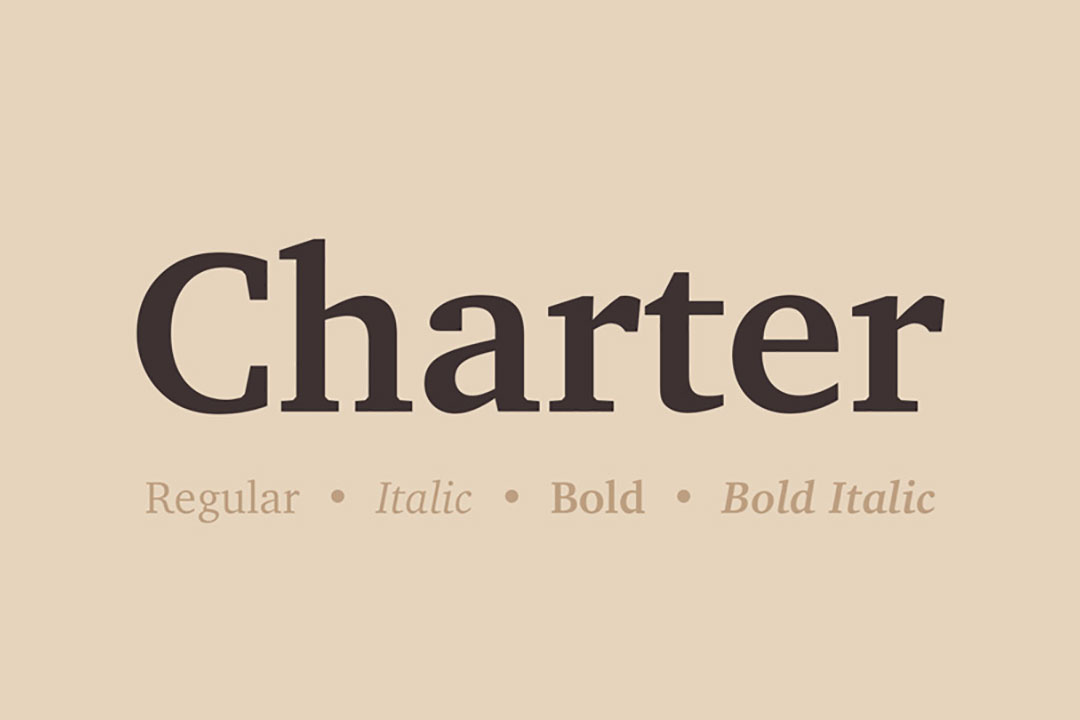
However, in larger blocks, it begins to feel that way.
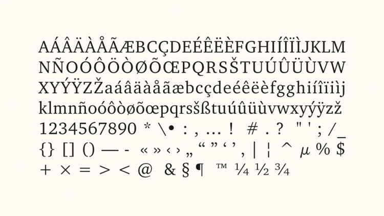
Not quite like
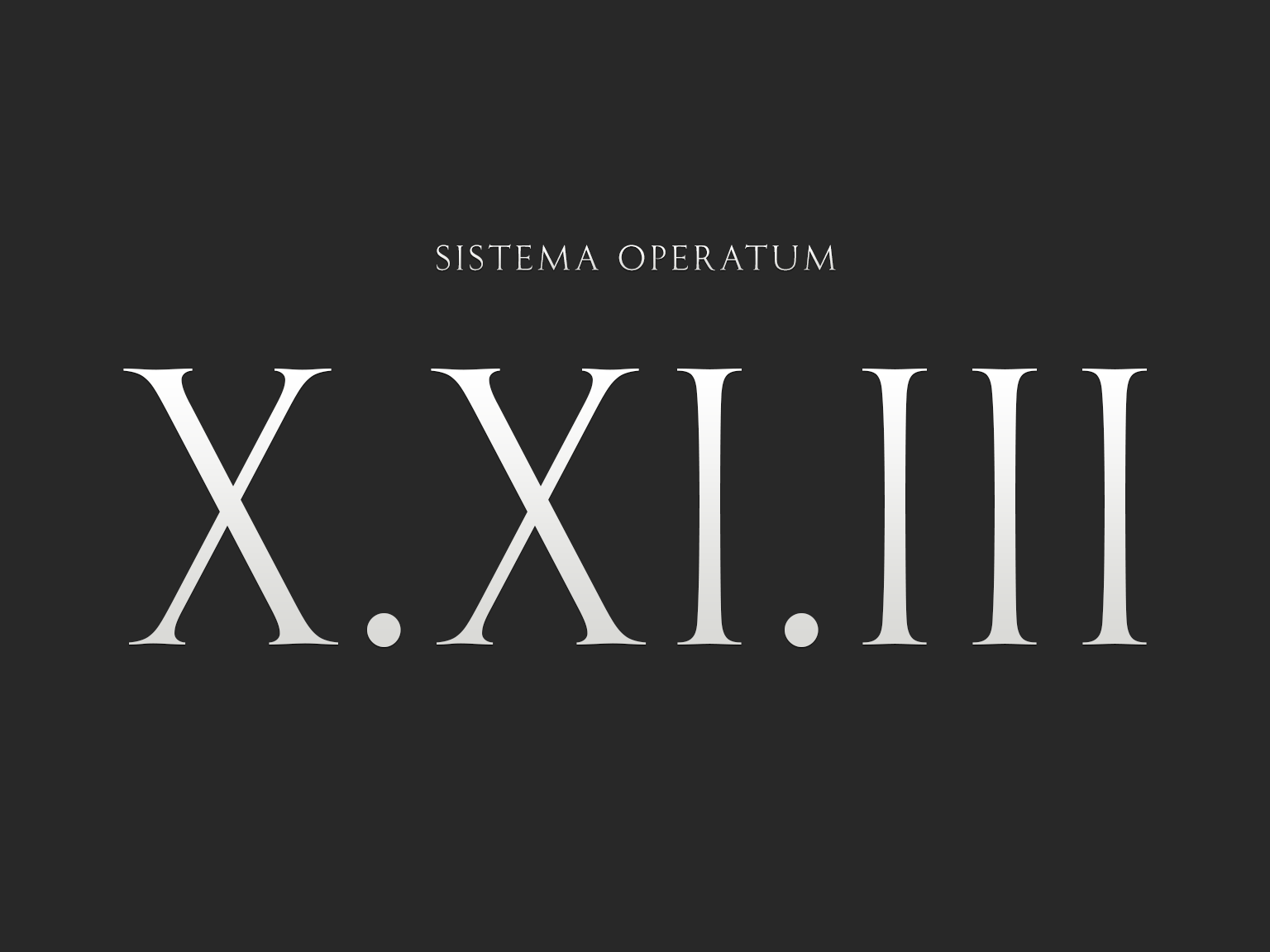
but getting there.
That’s when I found Source Serif. I had been using Source Code Pro for many years before that, because out of all the fonts I’ve tried for code and the terminal, Source Code Pro felt like home, so it’s not a surprise that Source Serif feels the same. It’s a nice middle ground between serif and sans-serif, of course having serifs nonetheless.
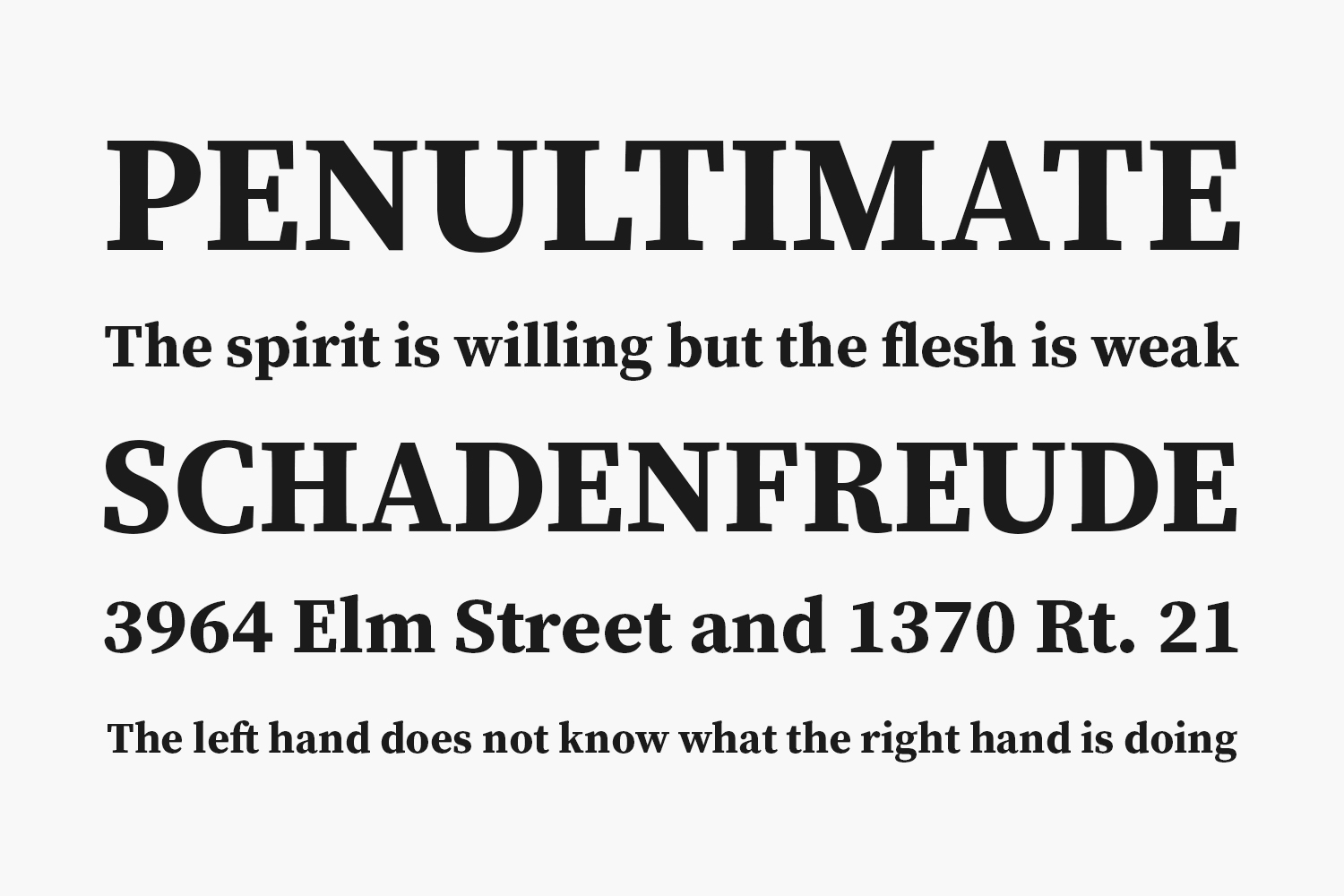
Like Charter, it’s inspired by artifacts from the transitional period of European typeface design in the 17th and 18th centuries, which is when printing was moving away from looking like it was handwritten. It’s also partly a slab-serif, which is a form that grew popular alongside printed advertisements in the early 19th century. These advertisements needed to grab people’s attention, and the thick, blocky serifs did just that.
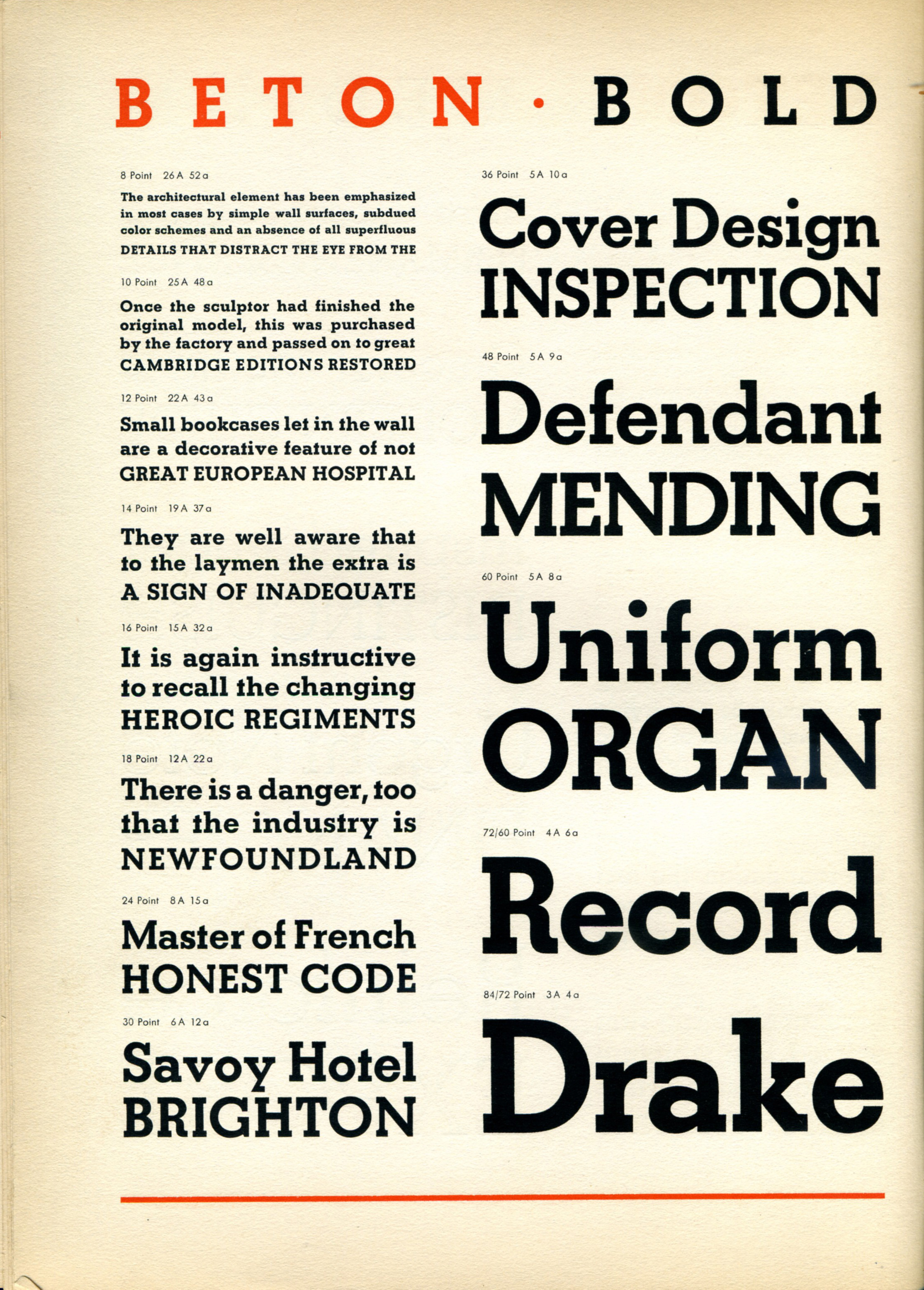
Here’s a slab-serif called Beton. Perfect for a poster.
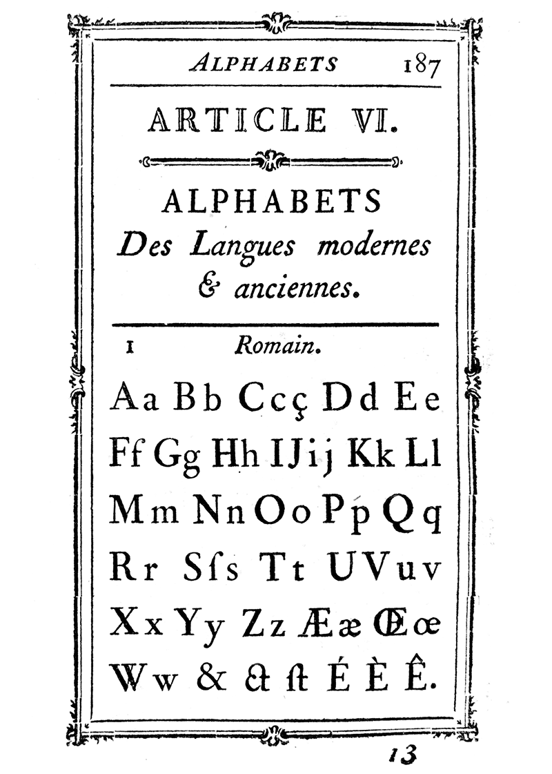
Why do Charter and Source Serif share so many similarities? It’s because they both spring from the same source, Pierre Simon Fournier.
Fournier was a punch-cutter and printer in 18th century France. (By the way, if you need a list of jobs which are now just machines in an office, the history of typography is a good place to find it.) He made contributions to the point system for measuring font sizes, and influenced, among others, Benjamin Franklin. He influenced Matthew Carter in the design of Charter, and Frank Grießhammer in the design of Source Serif.
Did Fournier expect his influence to reach so many people, perhaps soon one billion more?
I mentioned that I was looking for a family of typefaces that would be consistent across all my sites, including a blog that I write in Chinese. To my surprise, the family of typefaces also includes Source Han, in serif, sans, and monospaced variants, that covers 65,535 glyphs across Simplified and Traditional Chinese, Japanese, and Korean.
Of course, at this point it’s questionable how much of Fournier’s influence extends to the characters designed by the partners in this huge undertaking.
Furthermore, he most likely did not directly influence Source Sans or Source Code Pro, since those two came before Source Serif.
But, if Fournier’s designs could be used for inspiration in designing a serif counterpart to the existing Source Sans and Source Code Pro, then perhaps it already shared common elements with the two, knowingly or not. For this reason, I think I’ve found a perfect typeface for prose, code, and more, and between all those, it will, very subtly, feel familiar.