John Jago

Day 11: Visual improvements to the order view

Yesterday, a new release of Dashify went live!

The update included improved styles to the order page. The action buttons in the top right corner are more consistent with each other, and the products, taxes, and other line items are separated instead of all being in one table.

Screenshot of the WooCommerce order edit page, showing how the action buttons and line items look after recent changes.

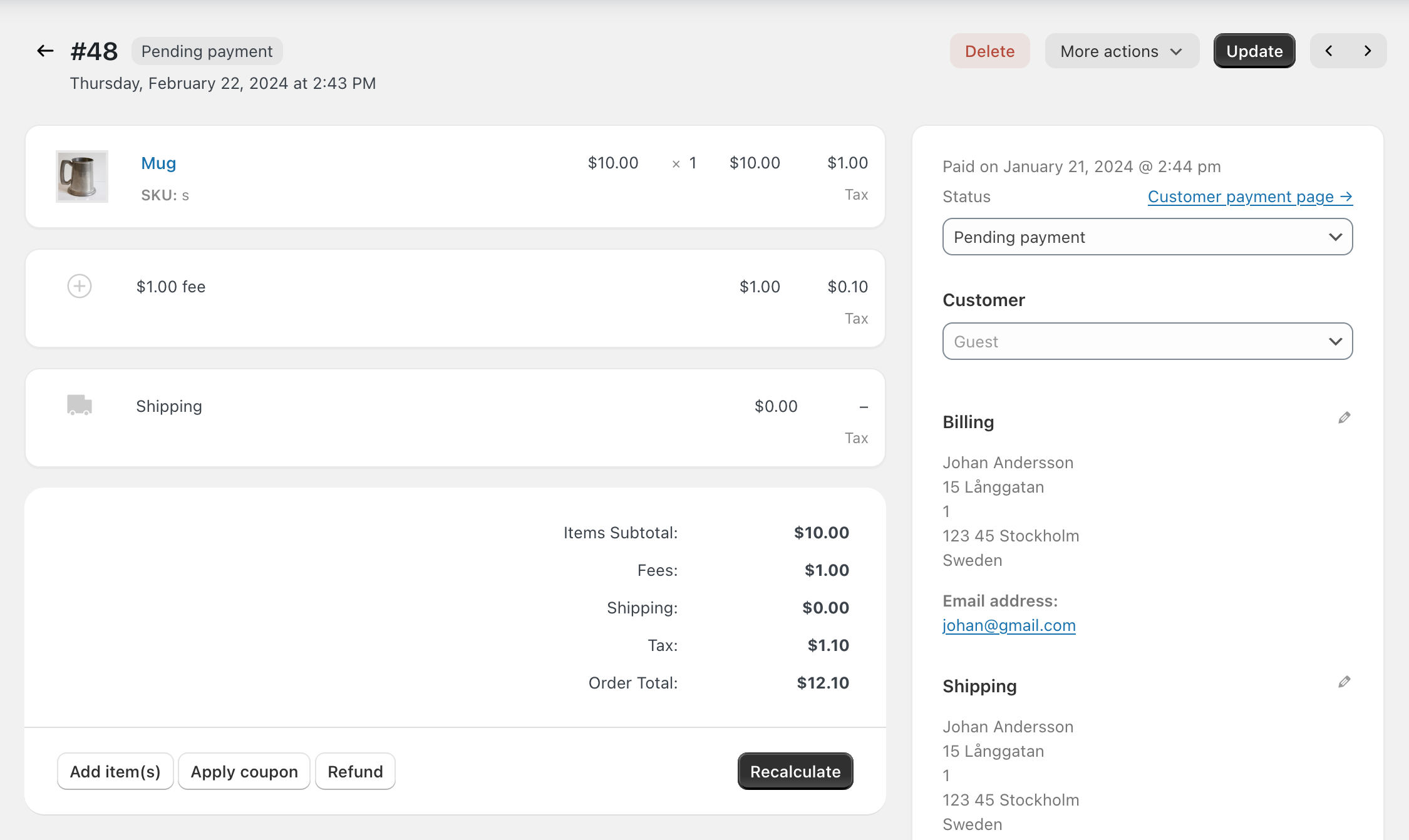
Although these are small changes, day by day they add up to something great.

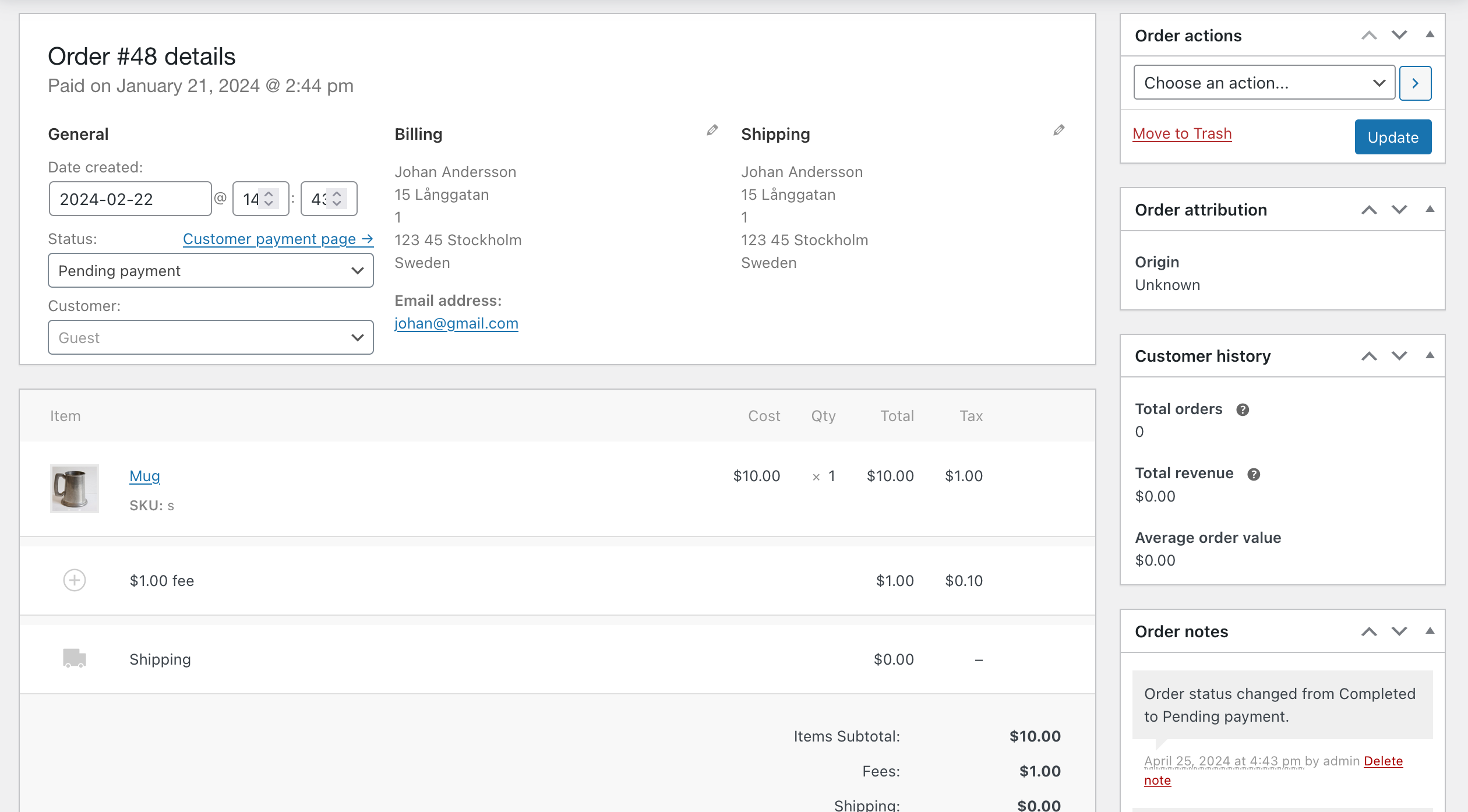
For reference, this is how it looks without Dashify.

Screenshot of the WooCommerce order edit page without Dashify turned on. The overall style and layout is not as visually appealing.


👋 You’re reading my work journal, a series where I write daily about my attempt to make a living building a bootstrapped software product.